Data visualization is the practice of turning data into charts and dashboards using tools like Tableau, Power BI, Excel, and Python libraries such as Matplotlib, Plotly, and Seaborn.
Modern enterprises generate terabytes of data daily, but only visualization translates those vague loads into patterns humans can process and employ. In fact, Gartner predicts that by 2025, 95 % of decisions that currently rely on data will be at least partially automated, meaning visualization and decision support systems will provide considerable support for business strategy. Turning raw datasets into comprehensive, interactive visuals allows teams to detect patterns, forecast trends, and approach all questions using real-time intelligence. Sophisticated and complex data means little if visualization doesn’t bring insights to the surface.
Python has established itself as a leading technology for building dynamic, scalable, and visually rich dashboards that integrate seamlessly with analytics workflows. Its robust ecosystem, featuring libraries like Matplotlib, Seaborn, and Plotly, helps teams turn massive, multidimensional data into more transparent reports. Apart from its technical flexibility, Python’s open-source nature minimizes licensing costs and supports long-term scalability across enterprise systems.
This guide explores the basics of data visualization, covering essential principles, tool selection, practical implementation strategies, accessibility standards, and leadership insights for creating visuals that genuinely drive organizational intelligence.
Table of Contents:
What is Data Visualization? Definition & Components
Data visualization is the graphical representation of information through visual elements such as charts, graphs, and maps, enabling users to identify patterns, trends, and anomalies that may remain hidden in obscure datasets. Its core components comprise data, visual encoding, such as axes, color, and shape, interactive elements for exploration, and contextual framing that gives meaning to the visuals.
Beyond aesthetics, the importance of data visualization lies in its functions as a storytelling medium, bridging the gap between technical analysis and executive insight. Within modern analytics ecosystems, visualization operationalizes understanding, interconnecting algorithmic outputs and executive action.
Importance & Business Value of Data Visualization
Functioning as the cognitive front end of analytics pipelines, data visualization renders high-dimensional data into comprehensible formats that support evidence-based decisions. By distilling large, multidimensional datasets into structured, visually appealing formats, organizations can discover correlations that remain invisible in raw numerical reports. Comprehensibility accelerates decision-making and minimizes the risk of misinterpretation, enabling leaders to act with precision instead of relying on intuition.
What is data visualization from a business perspective? It’s a strategy that can strengthen communication across technical and non-technical teams, coordinating every department around a shared idea of performance and objectives. Executives can track key performance indicators in real time, analysts can conduct detailed market and financial assessments, and operations managers can optimize resource allocation based on live data flows.
In a nutshell, effective data visualization services wrap analytics into a common language that connects planning, execution, and measurable outcomes, turning information into a competitive benefit.
Common Types of Visualizations & When to Use Them

The suitable visualization type is inalienable for conveying insights seamlessly and accurately. There is a range of visual forms, each serving a specific analytical purpose, helping audiences interpret data through structure, comparison, or spatial relationships. The effectiveness of visualization is assessed not only by the aesthetic aspect but also by selecting the appropriate representation for the underlying data and business goal.
Charts and Graphs
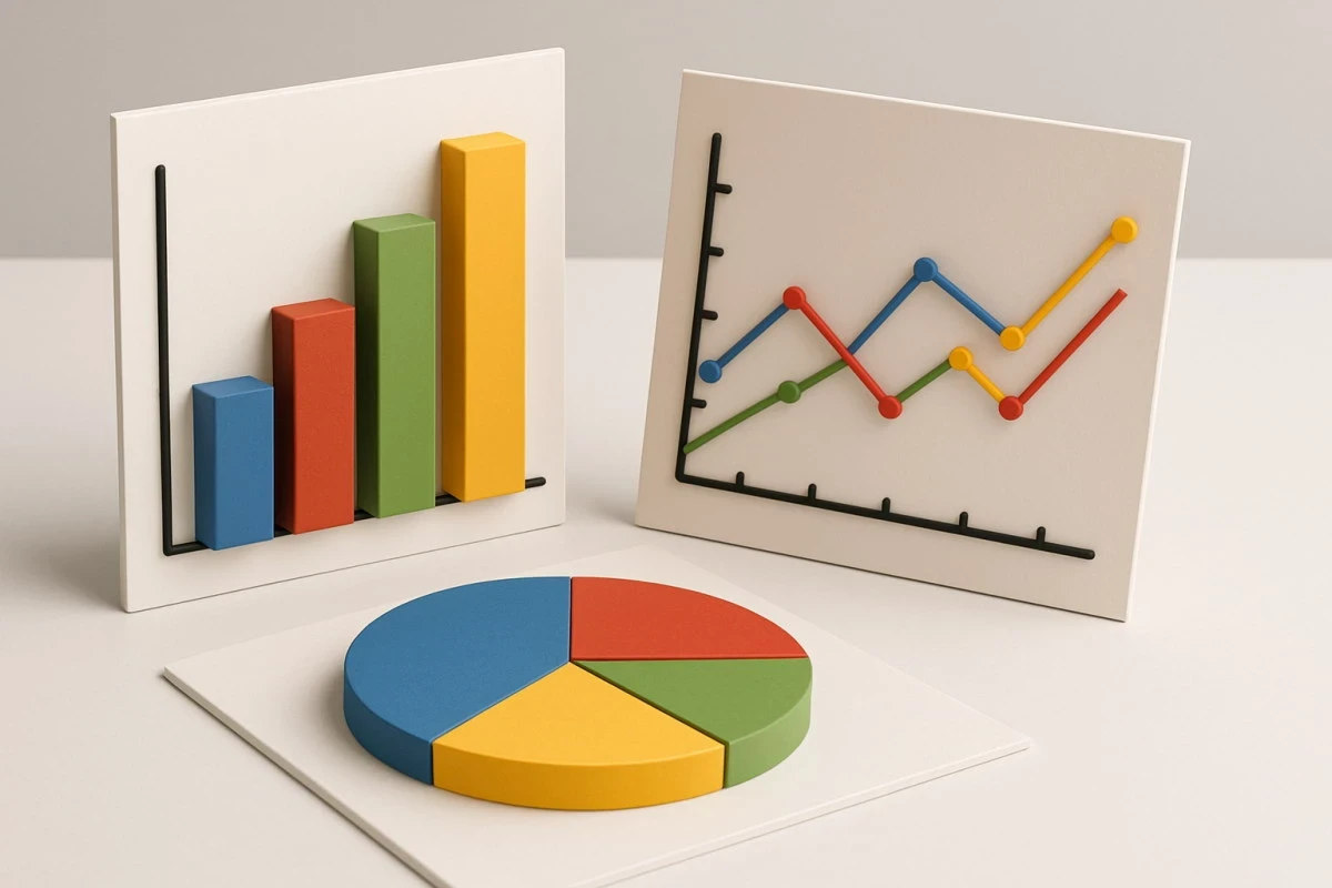
Charts and graphs remain the foundation of most data visualizations. Bar charts compare categorical values, which is perfect for performance metrics or regional sales analysis. Line charts visualize trends over time, helping identify growth trajectories, seasonal fluctuations, or anomalies. Pie charts are useful for showing proportional relationships, though they should be reserved for simple datasets with limited categories. Histograms reveal frequency distributions, while box plots expose variability and outliers within datasets. Scatter plots, in turn, help detect correlations or dependencies between two quantitative variables, which is crucial for grasping cause-and-effect relationships in finance, research and development (R&D), or marketing analytics.
Maps and Geospatial Visualizations
When data carries a location dimension, geospatial visualization is the most relevant option. Choropleth maps can display regional sales, population density, or risk exposure, while heat maps highlight concentration patterns such as customer activity or logistics demand. Such visuals are vital for businesses managing distributed operations or market expansion strategies, enabling leaders to visualize performance geographically.
Dashboards and Real-Time Insights
With dashboard development services, businesses can consolidate multiple visuals into an amalgamated analytical environment. They enable continuous performance monitoring by displaying key performance indicators (KPIs), financial measures, and operational metrics in one full-featured interface. Interactive dashboards, powered by Python libraries like Plotly, Dash, or Bokeh, allow users to filter data dynamically, providing the most up-to-date details for executives and analysts.
Advanced and Specialized Visuals
Aside from traditional charts, advanced visualizations address complex analytical needs. Treemaps illustrate hierarchical data such as product portfolios or cost breakdowns, bullet graphs benchmark KPIs against targets, and Gantt charts optimize project timelines. These are more sophisticated formats that offer businesses a deeper, more contextual understanding of their operations and performance dynamics.
Popular Data Visualization Platforms vs. Custom Python-Based Solutions
The optimal data visualization techniques depend on an organization’s analytical objectives, technical capabilities, and long-term scalability needs. Commercial tools such as Tableau, Power BI, and Looker Studio offer rapid deployment and user-friendly interfaces, whereas Python-based frameworks provide higher flexibility, customization in each aspect, integration depth, and governance control.
Tableau
Tableau remains one of the most widely adopted data visualization tools for enterprises. It has an intuitive drag-and-drop interface that allows teams to transform complex datasets into appealing visuals without writing code. Tableau can equip you with a strong visual engine that smoothly handles advanced analytics, interactivity, and storytelling – excellent for organizations seeking rapid insight generation and executive-level reporting.
Power BI
Power BI offers seamless integration within the Microsoft ecosystem, connecting cohesively to Excel, Azure, and SQL databases. It’s a cost-effective choice for entrepreneurs already invested in Microsoft infrastructure, enabling quick adoption and real-time collaboration across departments. Its robust reporting and DAX language, which stands for Data Analysis Expressions, provide both conciseness for business users and power for technical analysts.
Google Looker Studio
Google’s Looker Studio (formerly Data Studio) delivers cloud-native, browser-based dashboards that integrate easily with Google Analytics, BigQuery, and Sheets. This may be a great option in case your business requires lightweight reporting and marketing analytics, offering a balance of usability and flexibility for teams already embedded in Google’s data ecosystem.
Strengths of Platforms
Modern visualization platforms ensure a relatively faster setup with minimal coding, making them accessible to both technical and non-technical users. Their intuitive interfaces allow teams to start building dashboards independently, while pre-installed sharing, collaboration, and hosting capabilities streamline deployment. Enterprise-grade security, governance, and scalability make these tools especially beneficial for large organizations prioritizing speed and compliance.
Limitations of Platforms
Despite their advantages, commercial tools introduce specific constraints and drawbacks. Licensing costs often increase significantly as teams scale or require advanced features. Customization options are limited by pre-defined templates, and heavy reliance on a specific vendor can create lock-in risks. In data-mature organizations with specialized analytics pipelines or complex visualization needs, rigid tools can hinder innovation and adaptability.
| Platform | Key strengths | Limitations | Best for |
| Tableau | Intuitive drag-and-drop interface; strong visual capabilities; enterprise-level scalability; rich community & extensions. | High licensing costs; limited code-level customization; dependency on Tableau ecosystem. | Large enterprises prioritizing ease of use, aesthetics, and fast deployment. |
| Power BI | Deep integration with Microsoft ecosystem; affordable licensing; strong data modeling and reporting; easy for business users. | Custom visuals require DAX or scripting; less flexibility for unique designs; potential performance limits with very large datasets. | Mid- to large-sized organizations already using Microsoft stack. |
| Looker Studio (Google Data Studio) | Cloud-based; integrates easily with Google Analytics, Sheets, and BigQuery; suitable for lightweight, quick reporting. | Limited advanced visualization options; less control over custom interactivity; scalability limits for complex dashboards. | Marketing, e-commerce, and analytics teams using Google Cloud products. |
Python-Based Custom Solutions
Python data visualization frameworks, such as Matplotlib, Seaborn, Plotly, Bokeh, Dash, and Streamlit, enable businesses to design tailored, interactive dashboards that sync perfectly with internal data models and workflows. Such tools integrate directly with APIs, databases, and machine learning pipelines, allowing for advanced customization that surpasses what commercial platforms offer. As open-source solutions, they optimize software expenses and take advantage of an enthusiastic developer community that continuously enhances and upgrades functionality, which makes Python good for data visualization across any domain.
Strengths and Benefits of a Custom Dashboard
The benefits of a custom dashboard built with Python-based tools include deep integration with existing analytics systems, high scalability, and total control over visual logic and interactivity. These solutions can be precisely aligned with business goals, ensuring data is represented in ways that best serve operational and strategic needs. The result is a visualization environment that grows with the organization, supporting long-term efficiency.
Limitations of Python-Based Solutions
Developing custom visualization systems in Python requires deep expertise and ongoing maintenance. Compared to drag-and-drop tools, initial development takes longer, and support responsibilities typically rest with internal engineering teams. Nonetheless, this investment recoups in the future due to long-term independence, flexibility, and the ability to adjust or update dashboards alongside business growth.
| Library / Framework | Key strengths | Limitations | Best for |
| Matplotlib / Seaborn | Excellent for static, publication-quality visuals; powerful statistical plotting; integrates seamlessly with NumPy and pandas. | Less suitable for interactivity; requires coding proficiency; more manual styling. | Data scientists and analysts producing research or reports. |
| Plotly / Dash | Highly interactive and customizable dashboards; web-based; integrates with Python, R, and JavaScript; enterprise-ready variants available. | Requires developer effort; hosting and scaling depend on internal infrastructure. | Teams building interactive dashboards for web or internal applications. |
| Bokeh | It enables real-time streaming and interactive visualizations and integrates well with Flask or Django backends. | Smaller ecosystem; less out-of-the-box polish compared to Plotly. | Developers building live analytics tools or monitoring systems. |
| Streamlit | Simplifies turning Python scripts into interactive apps; minimal boilerplate; fast prototyping. | Limited fine-grained design control; less suited for large enterprise dashboards. | Data scientists creating quick prototypes or proof-of-concept dashboards. |
Comparison for Managers
In case quick deployment and ease of use are part of your business requirements, platforms like Tableau and Power BI can deliver immediate value for you. Entrepreneurs aiming for complete control, end-to-end customization, and integration with analytical pipelines will find Python-based development more goal-oriented and forward-looking. Many organizations adopt a hybrid model, leveraging Python for data transformation and advanced analytics, while presenting results in Tableau or Power BI for accessible reporting.
This approach creates a complementary ecosystem where Python supports computation and BI tools handle communication, maximizing Business Intelligence dashboard benefits such as speed, collaboration, and strategic insight alignment.
Python Tools & Libraries Overview
Selecting the proper foundation helps companies build a custom dashboard for data visualization efficiently. Python’s ecosystem represents a robust suite of libraries designed to cover every data visualization need from basic plots to enterprise-grade interactive dashboards. When choosing the right tool for your exact case, you should consider your project’s complexity, the required level of interactivity, and the technical expertise of your team.
Matplotlib
Matplotlib serves as the core visualization library in Python, forming the basis for many higher-level tools. It provides component-level control over every graphical element, allowing precise customization for static charts and figures. While not the most intuitive for beginners, it remains indispensable for its flexibility and reliability in scientific and engineering contexts.
Seaborn
Implemented on top of Matplotlib, Seaborn introduces elegant default styles and advanced statistical plotting functions. It is the best fit for analysts who need to visualize correlations, distributions, or categorical data with minimal configuration. Leveraging pandas integration, it supports fast iteration from data wrangling to visualization.
Plotly
Plotly brings interactivity to Python visualizations, supporting hover effects, zooming, and dynamic updates. It does exceptionally well in building production-ready dashboards and is often used alongside Dash, a companion framework that transforms Plotly charts into complete web applications.
Bokeh
Bokeh focuses on generating highly interactive, web-native visualizations rendered directly in browsers. It integrates seamlessly with streaming or real-time data sources, being suitable for monitoring systems and operational dashboards.
Other tools
Emerging frameworks such as Altair, Dash, and Streamlit continue to extend Python’s visualization ecosystem. Altair offers a concise, declarative syntax for creating complex charts with minimal code; Dash supports the development of fully interactive, production-ready dashboards; and Streamlit streamlines the process of transforming analytical scripts into intuitive, shareable web applications – all open-source and community-driven.
Best Practices for Creating Effective Visualizations

Effective visualization design integrates statistical accuracy with perceptual clarity and accessibility standards. Each graphic element should reinforce, not obscure, the underlying data relationships. When executed correctly, visualizations enable users to extract valid insights efficiently and conveniently.
Audience-centric design
Begin every visualization with an in-depth understanding of the audience’s needs and data literacy. For instance, executives typically require concise, high-level overviews with clear takeaways, while analysts gain value from in-depth, exploratory visuals. Matching complexity and visual style to the audience’s expectations ensures that data supports specific goals instead and optimizes workflows.
Clarity & minimalism
Simplicity amplifies comprehension. Make sure to avoid decorative or redundant elements such as unnecessary gridlines, 3D effects, or excessive annotations. Focus attention on core metrics and relationships that straightforwardly contribute to the narrative or business insight.
Choosing the right chart type
Selecting the proper visualization form is vital for accurate interpretation. In short, line charts emphasize trends, bar charts highlight comparisons, scatter plots reveal correlations, and heatmaps expose patterns. Consequently, a misaligned type can distort meaning and lead to incorrect conclusions.
Visual encoding
Visual encoding translates data into form. Use consistent scales, proportional spacing, and precise color gradients to maintain data integrity. Shape and size should represent quantitative differences accurately, ensuring that viewers interpret magnitudes correctly.
Color usage & contrast
Color strengthens understanding when it serves a purpose over decoration, directing focus, distinguishing categories, and supporting clarity. Employ high-contrast palettes that remain legible in various conditions and accessible to users with color vision deficiencies. Enhance color distinctions with textures, labels, or patterns instead of relying solely on tone.
Labels, titles, legends & context
Titles and annotations frame the narrative of your data. Use concise yet descriptive titles, clearly labeled axes, and meaningful legends. Always include source information and context so stakeholders can interpret visuals confidently and trust the insights.
Interactivity when needed
Interactivity promotes engagement and exploration but must be applied judiciously. Features like filters, tooltips, or zoom help users uncover deeper insights, yet dashboards should always provide static alternatives for accessibility, reporting, or offline use.
Accessibility
Provide alternative text or accompanying data tables for all visuals, ensuring compatibility with assistive technologies. Interactive dashboards should support keyboard navigation and maintain a strong color contrast. Use readable fonts, consistent typography, and clear summaries or captions so every viewer, regardless of ability, can access, comprehend, and act on the information presented.
Common Pitfalls & How to Avoid Them
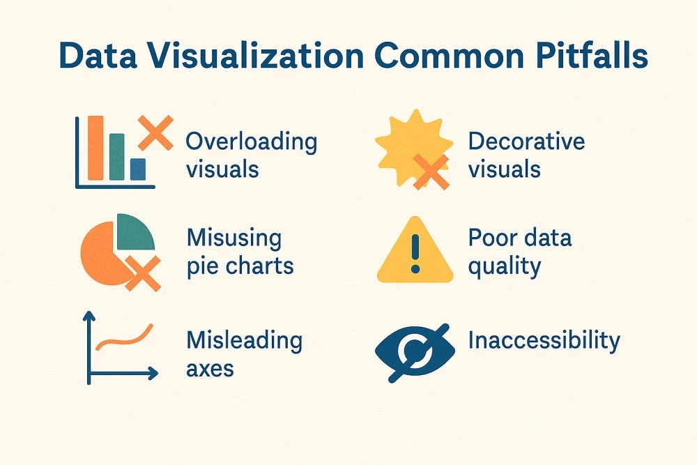
No matter how high-end the platform, neglecting essential visualization principles can obscure meaning and mislead interpretation. To avoid such bottlenecks, we highly suggest following proven design practices to safeguard clarity, accuracy, and credibility.
Overloading visuals with too much data or too many variables.
Cramming excessive information into a single chart is a guaranteed method to achieve cognitive overload and confusion. Instead, prioritize clarity by highlighting only the most relevant metrics or dimensions needed to support the decision at hand.
Using flashy or decorative visuals that distract or mislead.
Visual effects, 3D graphics, or unnecessary animations may appear impressive, but often distort perception. Therefore, you should prioritize readability and analytical precision over aesthetics.
Misusing pie charts or using inappropriate chart types for data.
Pie charts are frequently misapplied, primarily when representing numerous categories or slight differences. It’s worth choosing chart types that accurately express relationships and comparisons.
Poor data quality: unclean data, missing values, misalignment.
Unclean or inconsistent data undermines credibility. Always validate data sources, clean inconsistencies, and align units or dimensions before visualization.
Misleading axes (non-zero baselines), inadequate scale, distortions.
Manipulated or truncated axes can exaggerate differences and misrepresent findings. Maintain zero baselines where appropriate and ensure proportional scaling.
Ignoring accessibility and audience needs.
Failing to design for diverse audiences, such as users with visual impairments or non-technical stakeholders, limits usability. Take the accessibility aspect into consideration and tailor visuals to the viewer’s level of skills and expertise.
How to Leverage Data Visualization in Teams
For executives, the data visualization definition captures how strategy is seen, shared, and executed. When governed effectively, it provides a deep shared understanding, strengthens accountability, and supports the decisions across all departments.
Establish data visualization standards/style guides in the organization
Creating internal visualization standards promotes uniformity in design, color usage, labeling, and layout. A style guide ensures that all dashboards and reports adhere to the same visual language, strengthening brand identity and comprehension across teams.
Ensure data governance and quality
Strong data governance backs reliable visualization. Managers should enforce validation, version control, and access management to prevent inconsistencies or unauthorized data manipulation.
Invest in tools & training for data teams
Facilitate analysts and developers with the right technologies and continuous education. Regular workshops on visualization principles, accessibility, and Python libraries enhance both efficiency and analytical depth.
Review visualizations
Executives should periodically review dashboards to confirm data accuracy, narrative clarity, and compliance with accessibility standards. Feedback loops between stakeholders and data teams can help achieve iterative improvement.
Incorporate visual insights in strategic planning & communication
Cognitive analytics elevates strategic conversations from data review to insight-driven alignment. When visual analytics are woven into daily decision-making, they turn complex data into a shared language, bridging leadership vision with operational execution.
How to Get Started & Scale Visualization Initiatives
The roadmap to effective visualization begins with focus and foresight. By starting lean, learning continuously, and scaling intentionally, organizations turn data visualization into lasting outcomes.
Pick a high-value metric or dashboard, iterate
Begin with a focused use case, such as visualizing a key operational or financial metric, to demonstrate tangible value. Iterative development enables quick feedback, refinement, and stakeholder buy-in before broader rollout.
Introduce workshops, mentorship, internal knowledge sharing
Onboard and train teams through continuous education in visualization principles, Python tools, and storytelling techniques. Encourage mentorship and internal knowledge exchanges to establish a data-literate culture across departments.
Select a proper tool & infrastructure: open source vs commercial, deployment plans
Select visualization tools that align with business requirements, scalability goals, and technical expertise. Balance open-source flexibility with commercial reliability, and plan for secure deployment within existing infrastructure.
Build dashboards & reports that are maintainable & modular
Design dashboards using modular, reusable components. Clear documentation, version control, and standardized templates ensure that visual systems remain maintainable as data sources and business needs change.
Examples & Case Studies
When designed effectively, data visualizations make complex information intuitive, enabling faster insights, better collaboration, and more thoughtful decisions across the organization. As our PLANEKS case study, along with other data visualization examples, shows, an optimized visualization solution can improve operational efficiency and generate real, quantifiable value to many businesses.
Dashboard Platform Development
PLANEKS collaborated with Spontivly, a U.S.-based data analytics company, to build a customizable dashboard platform that integrates seamlessly with over 120 third-party tools such as Slack, Zoom, Discord, LinkedIn, and Twitter. The platform was developed using Python, React.js, Highcharts.js, PostgreSQL, AWS, and Docker, offering 10+ chart types and a drag-and-drop interface that enables even non-technical users to create and modify dashboards effortlessly.
The solution introduced advanced filtering and SQL configuration tools for accurate, customizable data visualization, along with separate organizational workspaces that support tailored dashboards, integrations, and permission management.
Today, Spontivly powers 70+ companies, providing access to 1,000+ data points and enabling 50% faster automation workflows. The platform optimizes complex data operations, centralizes performance tracking, and allows teams to visualize KPIs dynamically, making analytics a practical, intuitive foundation for business success.
Conclusion & Key Takeaways
As both a technical discipline and a creative practice, data visualization is the art and science of structuring raw information into visual formats that enhance perception and understanding. When executed effectively, it can become a strong assistant for leaders to detect patterns, uncover opportunities, and communicate insights accurately. The strongest visualizations achieve a balance between analytical rigor, visual simplicity, and storytelling intent.
For managers, success lies in setting clear standards for visual quality, ensuring data integrity, and establishing a culture where visual thinking supports every strategic discussion. Collaborate with PLANEKS to architect scalable, Python-based visualization solutions that integrate seamlessly with your data infrastructure.

